5 Errors in Architectural Visualization-the Company to Avoid Them
5 Errors in Architectural Visualization-the Company to Avoid Them
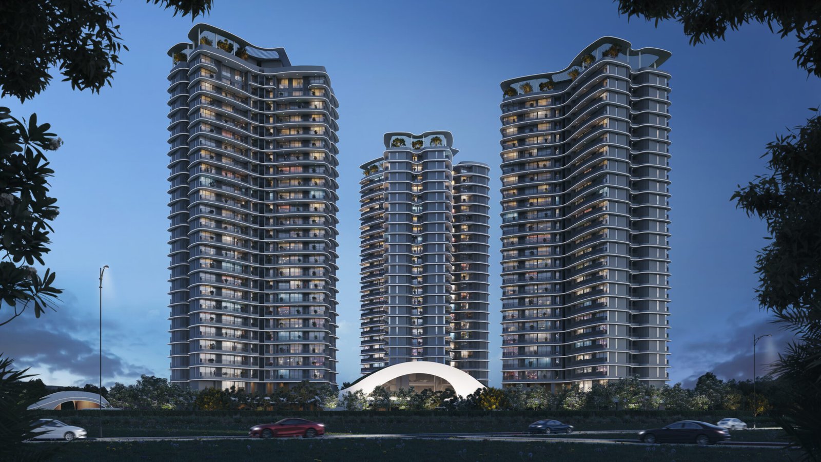
Architectural visualization is an essential part of the design and planning phase. It is a realistic preview of a building or space in advance of construction time. Many architects and designers make use of 3D renderings, walkthroughs, and other visual tools to showcase their concepts clearly, and clients can envision the final product. However, accurate and aesthetically pleasing renderings are not easily created; and there are a number of common mistakes that can be made to degrade the quality of architectural visualizations. Here, we will discuss five of the most common mistakes in architectural visualization and provide actionable advice on how to avoid these problems. For designers, architects, and clients, knowing where to look for potential pitfalls and how to rectify them can dramatically change the effect of your visualizations.
1. Poor Texture
Choice and Use One of the most glaring errors in architectural visualization is poor texture choice. Textures in 3D renderings help define the look and feel of a space, adding realism by simulating materials such as wood, stone, glass, and fabric. However, using the wrong or low-quality textures can give your visualizations a flat, unrealistic, or overly stylized look.
Common problems include:
Overused Patterns: Repeating the same pattern over large spaces will give an unnatural look. An example of wood flooring with the same grain repeated over and over across the whole space – very unnatural.
Poor Resolution Textures: Low-resolution textures lack the detail required for close-up shots, making surfaces look blurry or pixelated.
Inappropriate Scale: If the textures are not scaled appropriately to the model, the visual impact can be jarring. For example, brick textures that appear too large for a wall or tiles that are too small can break the illusion of realism.
How to Avoid These Mistake:
Use High-Quality Textures: Always opt for high-resolution textures to ensure fine details are visible, especially in areas that will be closely viewed. There are many high-quality texture libraries available online that cater specifically to architectural visualization.
Check the Texture Scale and Mapping: Ensure your textures are scaled appropriately to any real-world dimension size of materials represented by them. The texture should smoothly wrap itself across the surfaces without being distorted. It all depends on proper UV mapping to achieve realistic rendering.
Vary Textures: To avoid a repetitive or artificial look, try varying the textures slightly across a scene. For example, use a slightly different grain pattern for each piece of wooden flooring, or adjust the texture of walls and furniture for variety and realism.
2. Unrealistic Lighting
The most critical aspect of any architectural visualization is lighting-it makes the mood, defines the space, and influences how textures and materials are perceived. Unnecessarily unnatural lighting can make even the most intricately designed space look flat or artificial.
Lighting mistakes:Harsh or Overpowering Lighting: Where the lights are too harsh or spots, it might create an unnatural high contrast that will make the space feel less inviting or even unreal. Similarly, artificial lights could be too many, which will create an overexposed look.
Incorrect Natural Lighting: A space without a clear direction and intensity of natural light creates a not-so-real look, especially in shots taken outdoors or of indoors with big windows.
Abusy use of Ambient Lighting: Using ambient lighting alone may result in a poorly ambience. Ambient, direct and indirect lighting should all be used proportionately to create depth and realism.
Avoiding these Mistake
Simulate Real-World Light Sources:Whenever designing lighting, try to mirror real-world lighting conditions as accurately as possible. Use natural light whenever feasible to simulate the sun; as the time of day and the direction of light often vary in large windows or open spaces.
Balance Artificial Lighting: Balance artificial lighting with natural light. Use accent, task, and ambient lighting to achieve depth and realism through lighting. Observe how one behave in real life, like soft shadows and reflections.
Try Light Settings:There’s no need to just use the default lighting setting. Experiment with varying light intensities, color temperatures, and shadows and see how they impact the overall look of your scene.
3. Failure to Address Details in Materials and Finishes
Architectural visualization is the process of making a room come alive, and small details usually make a difference for the final output. Failure to detail materials and finishes may result in an unrealistic rendering, regardless of how well-designed the space is.
Common problems include:
Unrealistic Material Properties: Materials appear to be quite generic or lack the physical properties they would exhibit in real life. For example, light reflection on the glass might seem quite poor or shiny materials may come off as too matte.
Ignoring Surface Imperfections: Perfect, flaw-free surfaces don’t exist in reality. A lack of scratches, smudges, or slight discoloration can make an image feel fake.
How To Avoid These Mistakes:
Include Surface Imperfections: Because most real-world materials have imperfections, this step requires including small flaws such as scratches on a countertop or faint scuff marks on the walls, for example. Or, wood may exhibit some minor color variation.
Accurate Material Shaders: Proper shaders for materials to simulate how light behaves with different surfaces. For example, the way light bounces off a glass surface and interacts is different from that of a matte concrete wall. The proper understanding of the physical properties of the material translates into making it look realistic.
4. Wrong Camera Angles and Composition
In architectural visualization, the camera angle plays a huge role in how people will perceive space. A poor angle or ineffective composition will create either distorted proportions, unappealing perspectives, or it fails to draw attention to important design features.
Common mistakes involving cameras are:
Too Wide Camera Angles: Applying an overly wide camera angle creates a view that is impossible because it creates a distorted or disorienting look of space.
Unfocused or Cluttered Framing: Without careful composition of the shot, the renderings end up cluttered and busy and cluttered and not really emphasizing the main points of the design.
How to Avoid These Mistake:
Use the Right Camera Angle: Here, cameras may be used to highlight the most important features of the design. This could be an angle which accentuates the flow or other focal points of the space, whether it is a feature wall or grand staircase.
Follow the Rule of Thirds: As in photography, using the rule of thirds in the architectural visualization process can help create well-balanced and pleasing compositions. Don’t place critical elements at the very center and allow spaces that take the eye by natural leads.
5. Overuse of Post-Processing Effects
Refining color, contrast, and sharpness post-processing may enhance an architectural rendering. Overuse of such effects, however can start to detract from the quality of the render, looking unnatural, hence distracting from the design.
Common errors:
Over-Saturation- Setting the saturation or contrast level too high can cause the image to look oversaturated or a bit too harsh.
Excessive Blur or Depth of Field Effects: While depth of field effects can be used to direct the viewer’s attention to specific areas of a rendering, their overuse can make an image look overly stylized and reduce its overall realism.
How to Avoid These Mistakes:
Use Post-Processing Judiciously: Post-processing is used to further enhance the realism of the rendering rather than detracting from it. Color balance, exposure, and sharpness need to be adjusted gently in order to enhance the overall look without changing the natural feel to it.
Refine Depth of Field Effects: Depth of field effects should be applied discreetly. Focus on areas that deserve the viewer’s attention while still maintaining important parts of the design sharp and visible.
Conclusion
Architectural visualization can be a pretty powerful thing that can elevate the design process, while architects and designers are able to present their ideas in an immersive and realistic manner. However, unless a proper selection of texture is made, the lighting is unrealistic, or the camera angles seem off, all your good work can be brought down. With careful attention given to these details, there’s less chance of common pitfalls and more of a guarantee of rendering those perfect 3D images to capture the essence of your design.
At StudioFov, we specialize in creating high-quality 3D renderings, walkthroughs, and visualizations that bring your design ideas to life. We have in our team dedicated professionals with years of experience producing stunning architectural visualizations that lift the expectations of our clients. Working on and avoiding these common mistakes, we ensure that your project is visually portrayed in the most accurate way possible.
Visit StudioFov today and let’s help you create some breathtaking renderings that will definitely highlight the full potential of your architectural designs.